
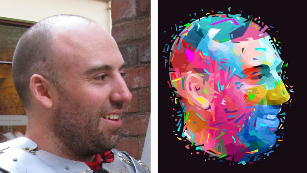
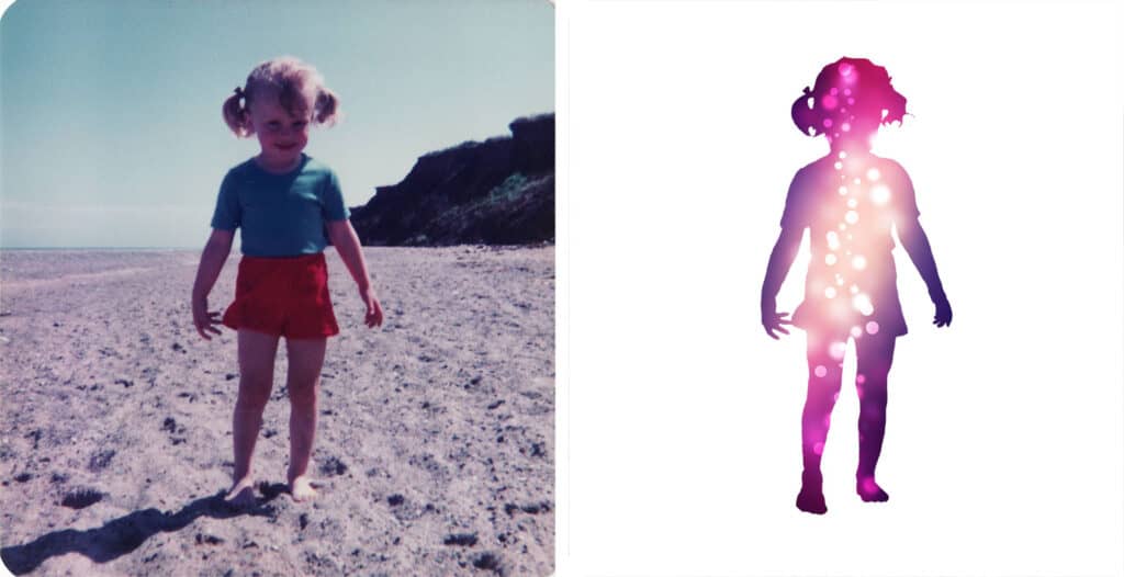
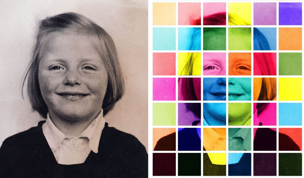
Portraits
Some of these were made as personal projects but others were made with a view to selling portraits for people in those styles.
I never sold any but there was some interesting work and they were worth doing in a way.

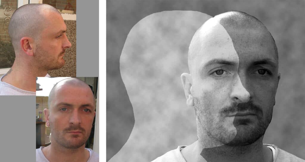


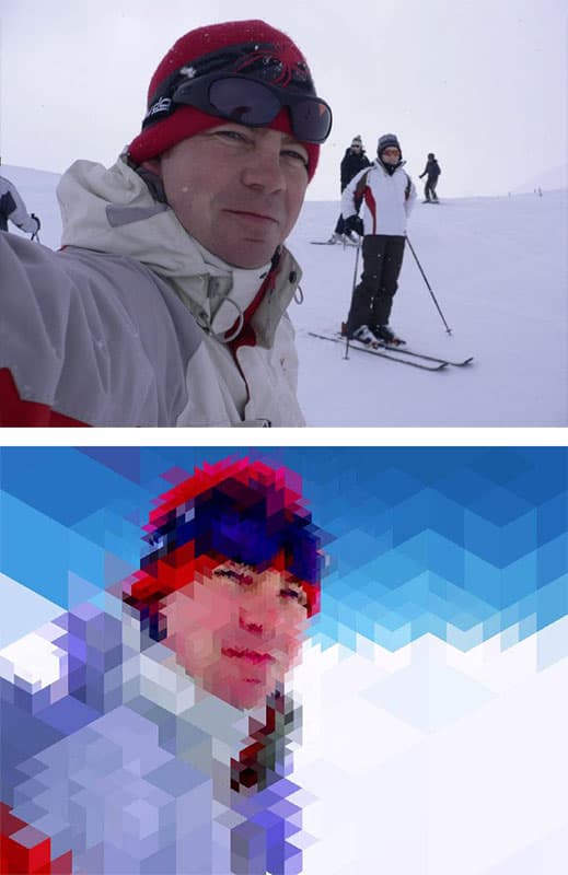


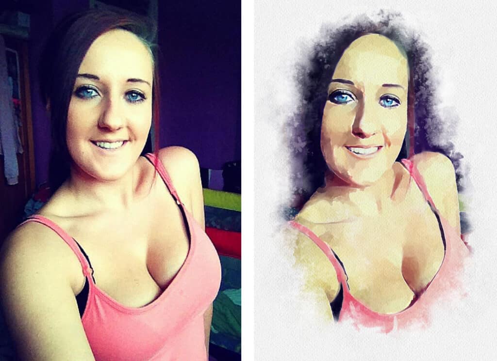
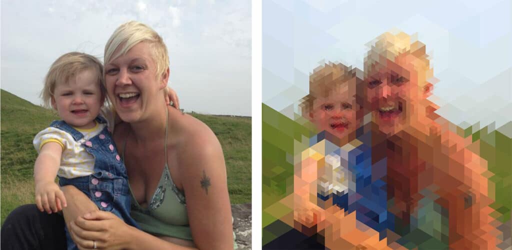


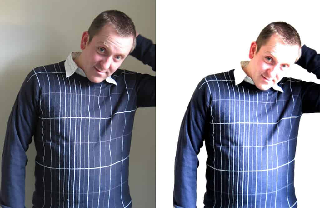
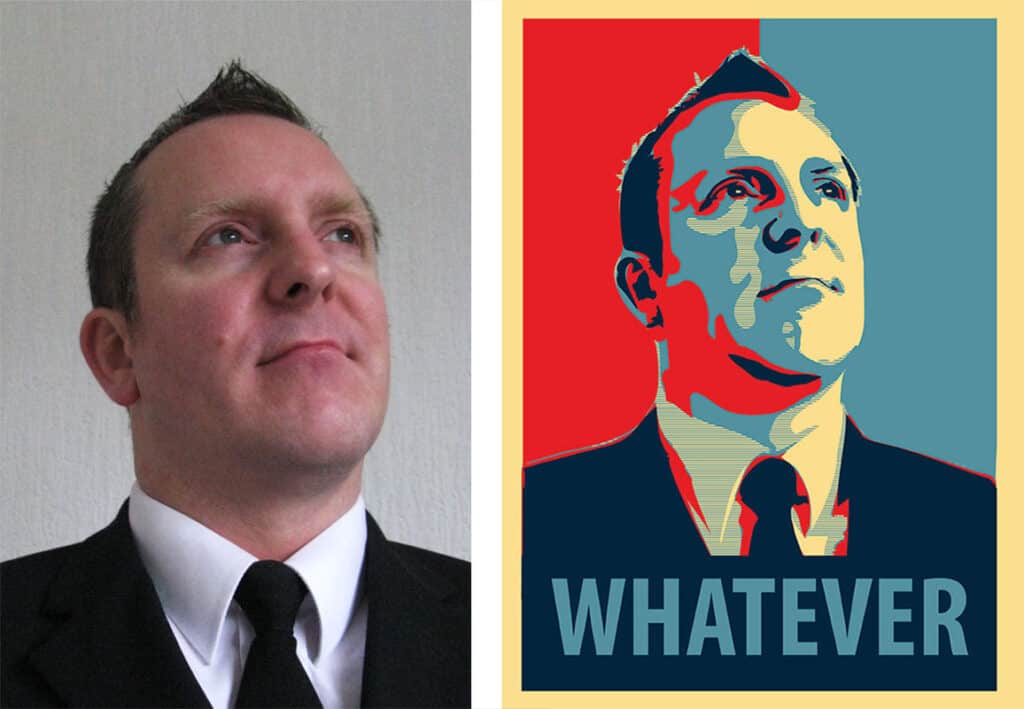

Me and a bunch of stuff I've done
Me and a bunch of stuff I've done
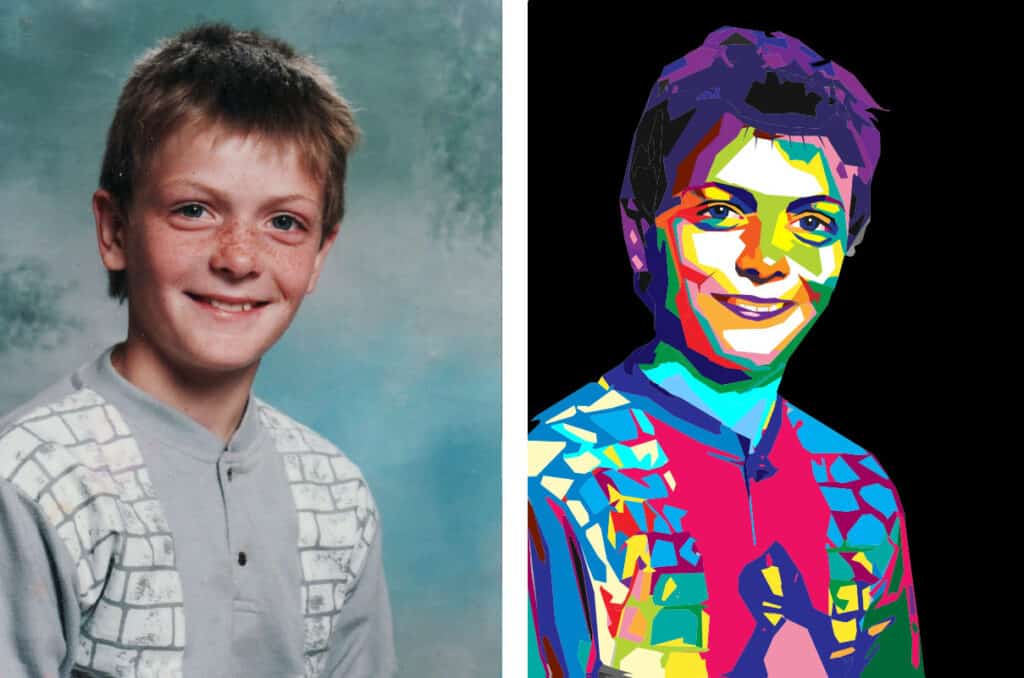
Some of these were made as personal projects but others were made with a view to selling portraits for people in those styles.
I never sold any but there was some interesting work and they were worth doing in a way.