
Shelter – Voronoi
Why
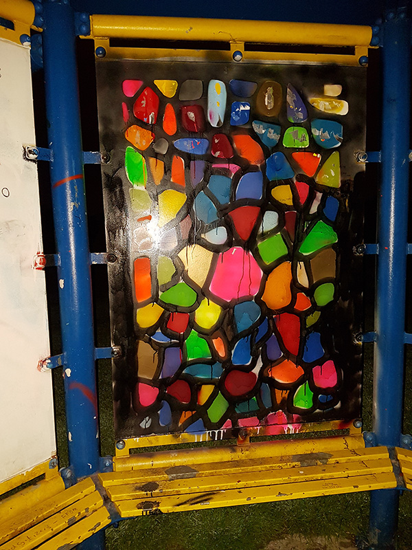
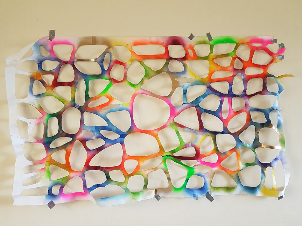
I was working with Voronoi shapes i some other stuff I was doing and they can look nice and organic, so I thought a big multi-coloured voronoi on the shelter would be good to cover up whatever cack was before it.It’s pronounced “vorra-noy” by the way.
When
June 2016

Production
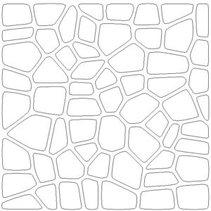
Mostly scalpel cutting. So much scalpel cutting.

Execution
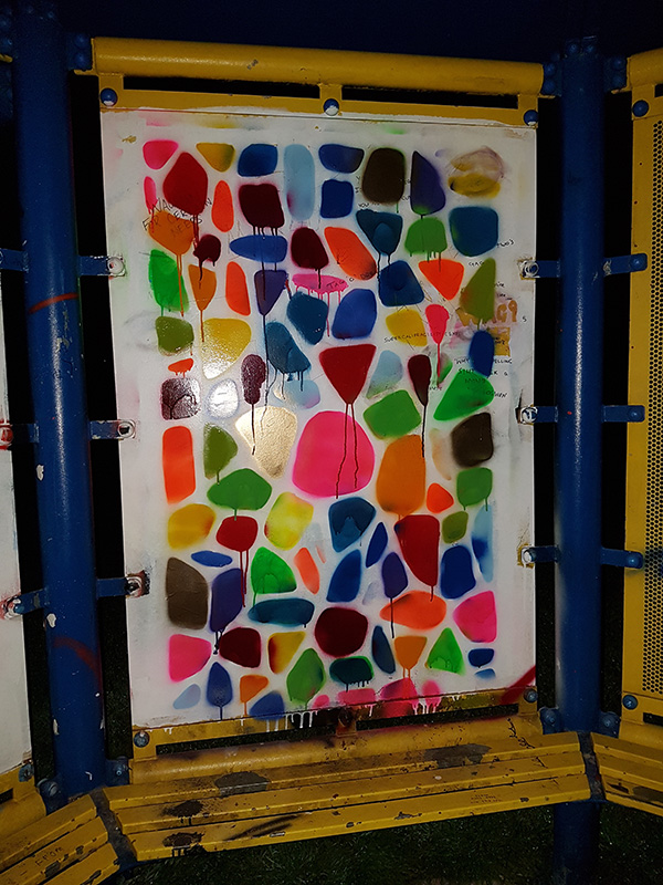
It didn’t go that well really and took a while.
Notes
The shelter art looked a pig by the end to be honest. I wasn’t happy with it. On the other hand, the stencil looked quite lovely. Maybe I should have made a better effort to preserve and mount it somehow. I did put it on my wall for a short while though.
Duration & Fate
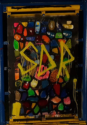
It got the “SDR” treatment in July 2017 and I will have changed it not longer after that.