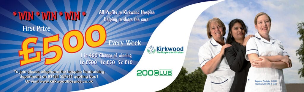
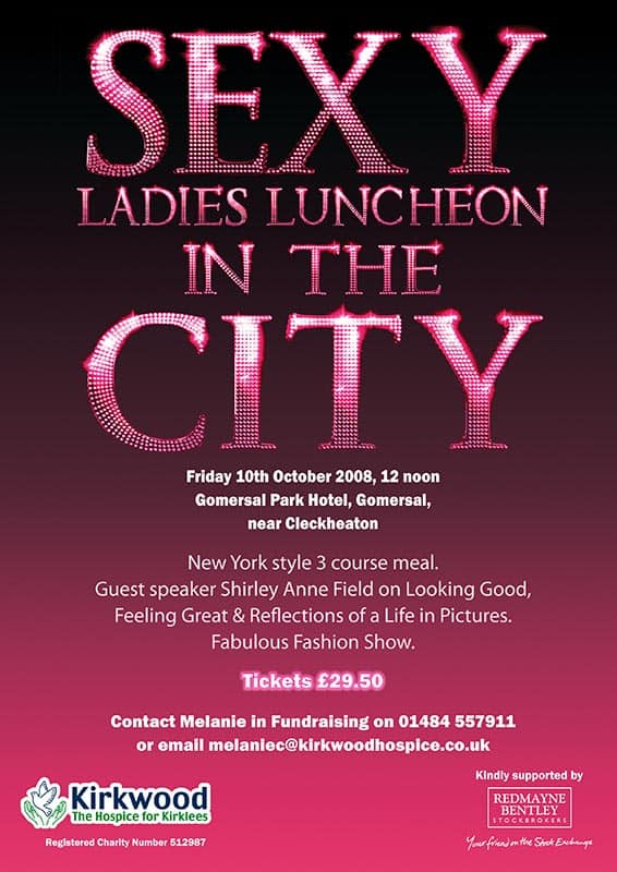
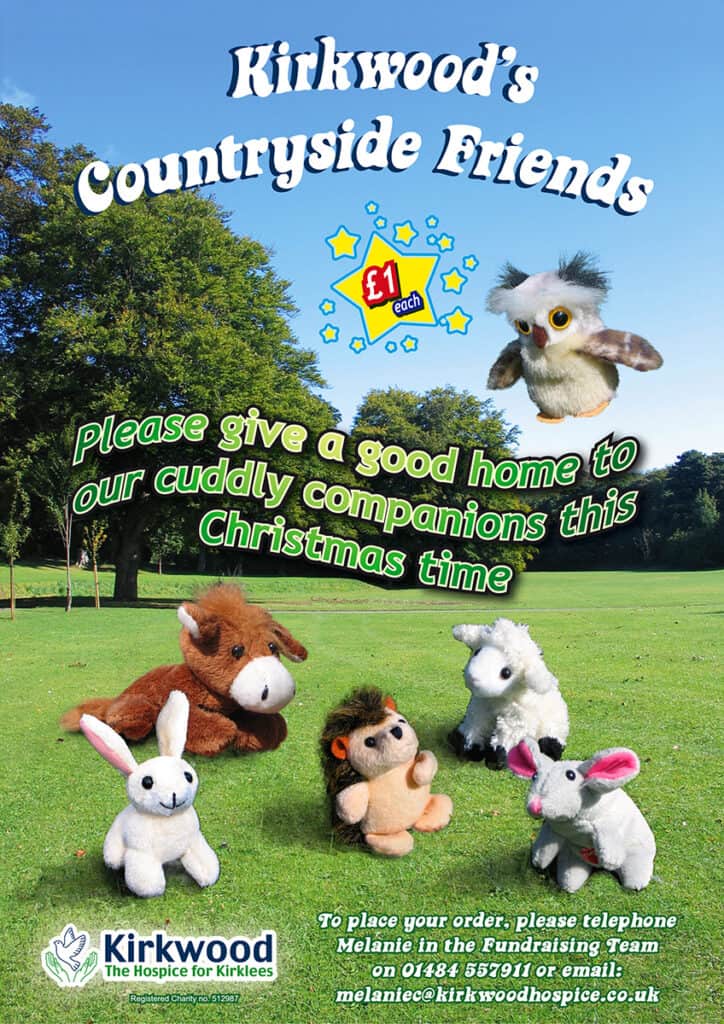
Hospice Promotional Design

My girlfriend at the time worked at a series of different hospices as a fundraiser. Any of the events that any of the team organised needed design work. They would often get other people to do this for them, but I had a background in graphic design and I was prepared to throw lots of time and effort at jobs for a bit of money for some of the work. This isn’t everything I did and I’ve left out most of the boring form bits.

An advert that was used on the inside of buses. (2007)
This was the front and back of a flyer for one campaign. The flyers always had a boring but complicated form to create that took a long time. (2010)
“Sex in the City” was at the height of its popularity and the hospice was having an event named similar to it. (2008)
I had to go out and photograph these toys and find some decent background for them to be on for this poster.(2007)
As basic as this is, it went through a lot of variations and developmental work to get to the end design. I annoyed myself by having the rippled sand perpendicular to the shore instead of parallel to it. And those palm trees really ought not to be there. >_< (2006)
A fairly standard looking promotional poster for a casino event. (2008)
This poster was quite basic but cheerful. There were also other more complex variants before this one was reached. (2006)
In retrospect, I think this was fairly ugly. There was a version with colourful hats, but I don’t think they liked that one. (2006)
This went through many variants and the material was something I photographed myself. I think it looks quite suitable. It was one of several events that I attended but have little recollection of. (2006)
This was a “Light Up A Life” card meant to signify the passing of time or the circle of life or something hopeful and ambiguous or whatever. The quality of my illustration wasn’t that great though. (2007)
This was some sort of greetings card. It was colourful and effective. Although it was one of the most basic designs, it’s probably one of my favourites that I did for any of the hospices. (2010)
This was the front and back of a flyer/programme for a “Light Up A Life” campaign. It always featured a portrait format of the image that would be used on the greetings card for the same campaign. (2008)
This was the inside of the same document.
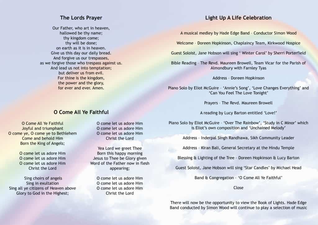
Having to include “The Lord’s Prayer” pained me. (2008)
One of the better LUAL designs I made. Somehow I seem to have lost all the associated work though. (2009)
This was another flyer for “Light Up A Life” campaign. A lot of effort went into selecting images to signify the seasons and the background also went along with the theme. (2006)
To amuse either myself or my girlfriend, I created an alternative version of the card for LUAL that year. Probably because the woman in charge of the project was uptight and probably religious etc. No-one knew, but I passive-aggressively included the dildo as a 1% opacity layer in the final card design above the lilac crocus. Which would be utterly imperceivable of course. But I knew it was technically there. (2006)

Leave a Reply

Your email address will not be published. Required fields are marked *