
Reproductions
Some of my other work is based on other things (like Rude Pantry stuff) but this is a short collection of things that were meant to be faithful recreations without big changes. Mostly graphics from film, television or other places for no particular good reason.
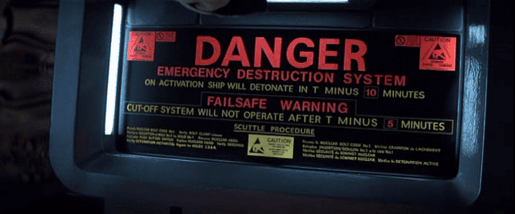
The Nostromo self-destruct panel from “Aliens” (1979)
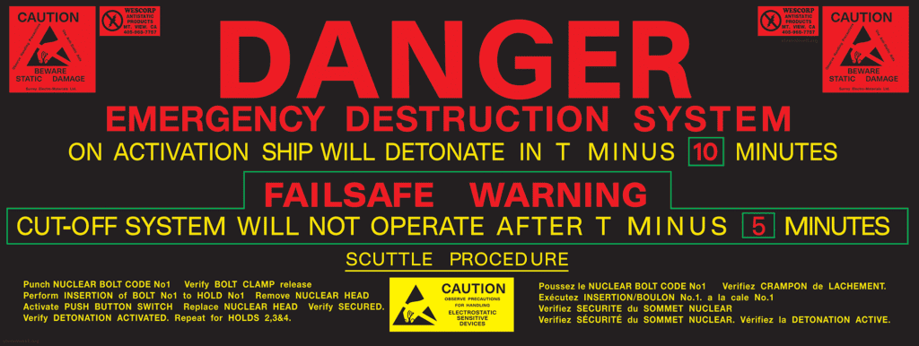
I quite pointlessly recreated the self-destruct instruction panel graphic on the Nostromo vessel from the 1979 film “ALIEN” and did a deep-dive on the detail that’s almost indiscernible from most sources.
Critically, I got the typography much more accurate to the original panel than any other reproductions of this I’ve seen. The typefaces, character widths, word spacing and REALLY erratic kerning have all been incorporated as faithfully as possible. I thought about correcting the French section but just left it incomplete and nonsensical as on the original prop.
I have no use for this, but threw quite a number of hours at it anyway. I like that the original was hand painted and typographically all over the place.
I did this in June 2024.

I also found that there’s mention of two real companies on there.
1. “Surrey Electro-Materials Ltd”, which is now a division of NewMet Ltd.
2. “Wescorp”, which still exists with the same name but a different logo.
I contacted them both to let them know they featured in the film but unsurprisingly this information was too dull for them to respond.
This level of detail is even only barely visible but still not legible in the 4k version of the film but I was happy to be able to (needlessly) establish the details.
Telephone Directories
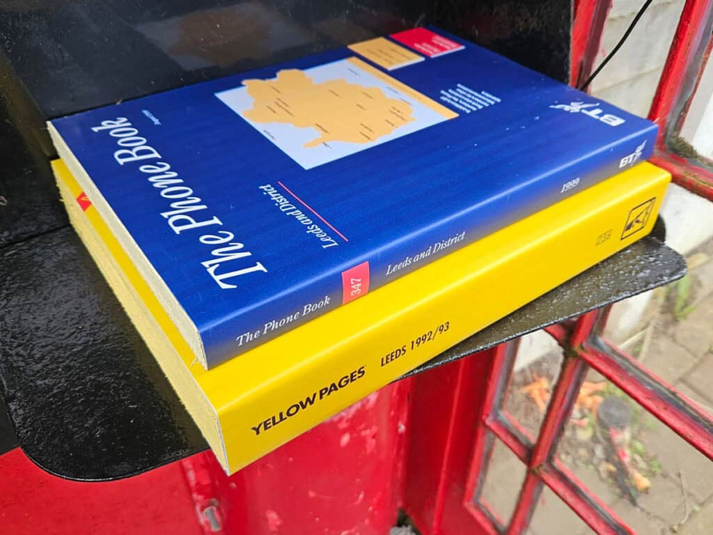
Since getting my Telephone Box in 2013, I’ve been striving to make it as authentic as possible. By 2024 I made the main elements but I wanted some telephone directories in there. Real vintage directories are now very rare or cost a small fortune on eBay. In June 2024 I decided to make some fake telephone directories from plywood. I had to redraw most of the graphics and typography. There’s something oddly satisfying about getting everything to match exactly, even if it’s very dull.
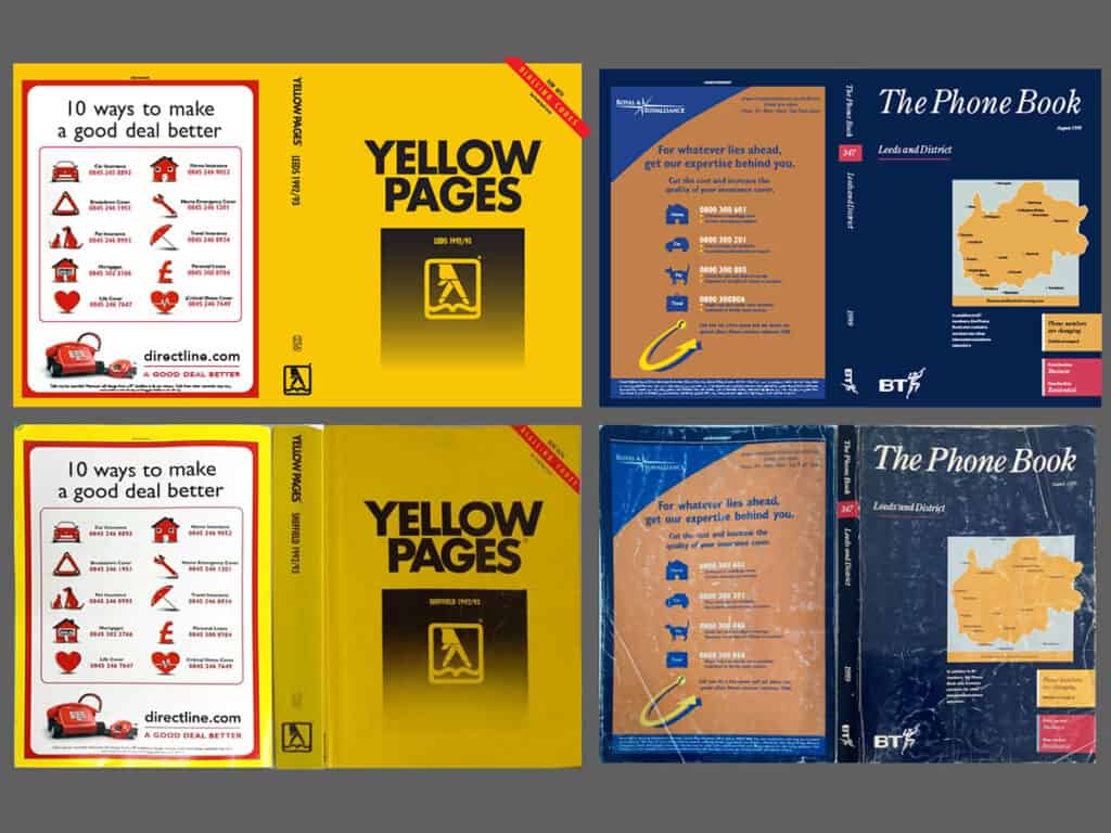
I found some photos of directories on eBay and corrected the image distortions. Then I meticulously reproduced the covers in accurate detail. However, there was one glaring anachronism. The rear cover of the Yellow pages features an advert with a website, but the front is based on a 1992 directory. The real advert from the 1992 directory was much more complicated and ugly than the one I used from a few years later.
The prop directories in place. These add a nice splash of colour to the interior.
Less “vital” than the directories, but for some amusing authenticity I decided to make some sex industry calling cards. I’d already made some of these a few years ago for a silly pointless project but now I had a sort of actual use for them. I adapted them to have my face on and I made some additional changes. The telephone number isn’t live, as it’s from a range reserved by OFCOM for use by Film and TV productions. These aren’t actual strict reproductions, but I’m putting them here anyway.
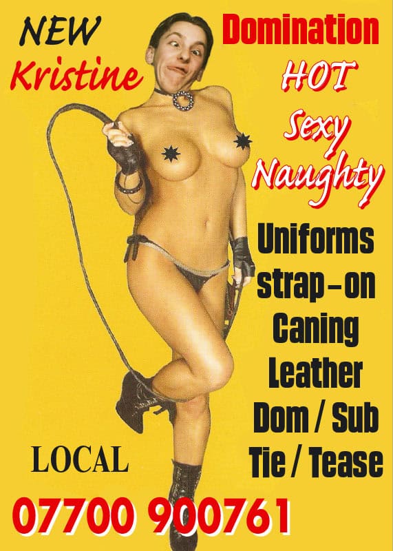
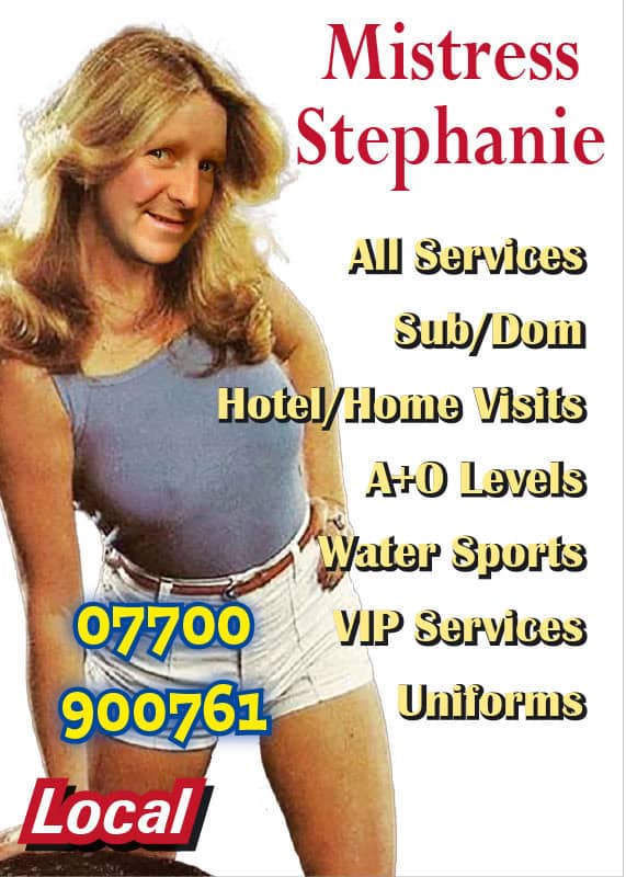
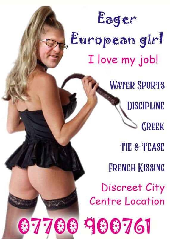
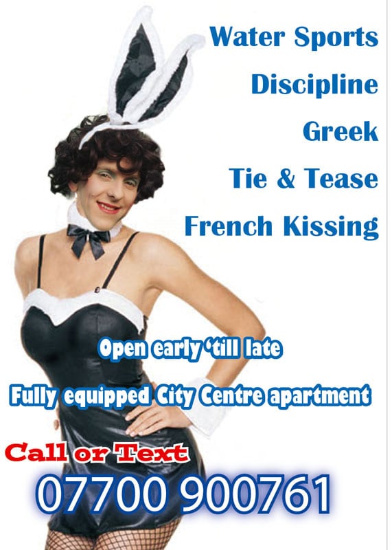

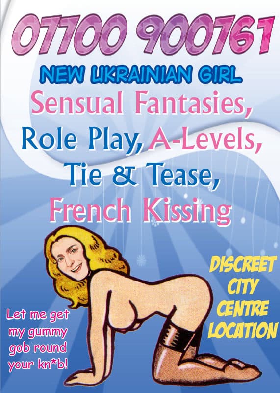
Quite disturbing.
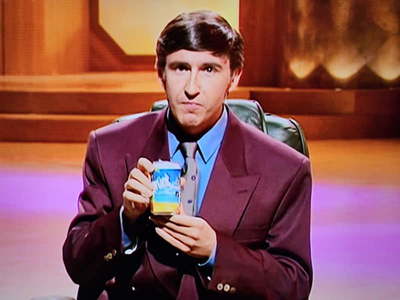
Stuff from various Alan Partridge episodes
Firstly, I absolutely love Alan Partridge shows. The character is a national treasure and a comedy icon. The programmes are excellent.
I found that I was having some spare time at work and was also avoiding working on bigger ongoing projects in my own time, so I randomly set about recreating some obscure graphics from various episodes of Alan Partridge shows.
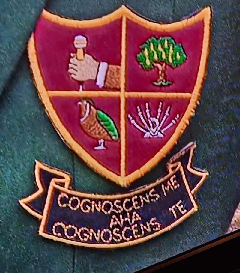
Alan’s Blazer Badge

I decided to recreate Alan’s coat of arms emblem thing, but change it a bit as if it didn’t need to be so simple for an embroidery.
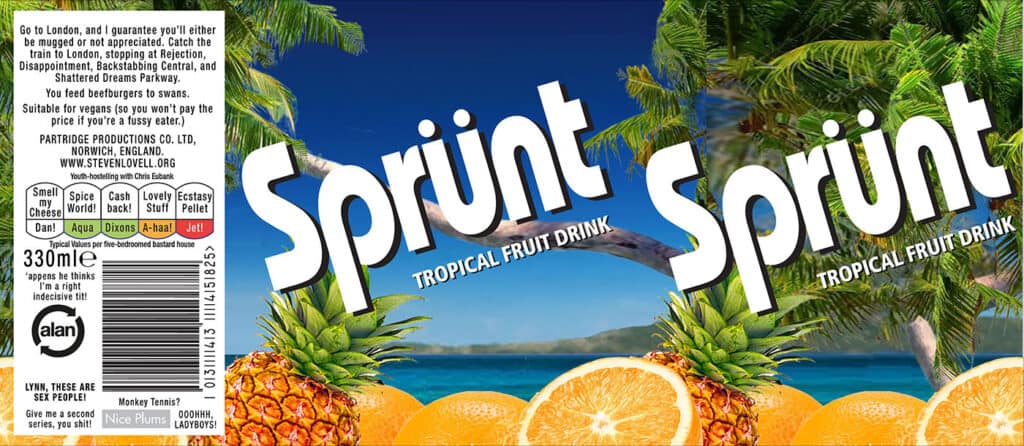
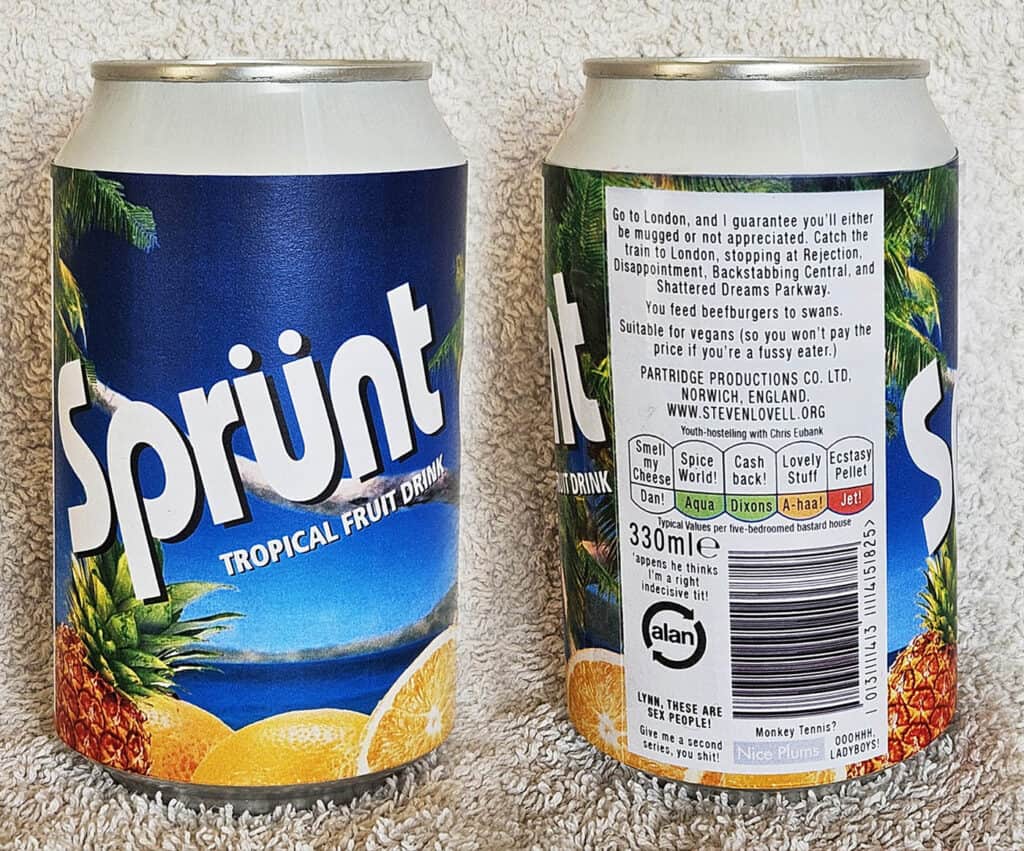
Can of “Sprünt” label
This was a label for a prop from the first series of Alan Partridge (1994). It’s a can of pop he was illicitly doing product placement for, on “Knowing Me, Knowing You – with Alan Partridge”, called “Sprünt”
This took me FAR more time than a silly project should do.
Oh, if you scan the barcode, it reads “Jackanackanory”. This was made in May 2024.
Danko Torches logo
This was a background graphic that Alan used when he was doing a personal appearance at Norwich railway station when he was trying to promote his soon to be pulped nook “Bouncing Back”. He was giving away torches from the local; BP garage as an incentive for buying his book. Sometimes people have recreated such things before I have, but I take pride in doing a much better job and using the same or much closer typefaces than other people have bothered to. Identifying fonts is strangely pleasing to me.
I did this in May 2024.

“SKIRMISH” poster

This was another background graphic from the same event. I had to redraw most of the “SKIRMISH” lettering as I suspect the original designer will have done as it was only loosely based on an existing typeface as far as I could tell. Re-made in May 2024.

(Which is mispelled.)
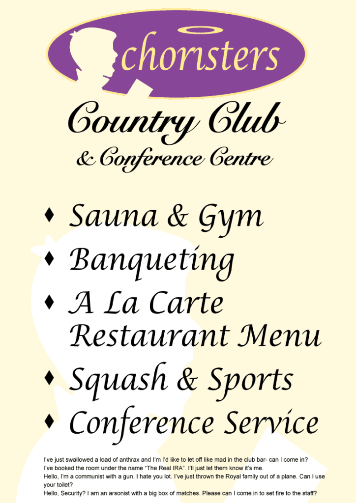
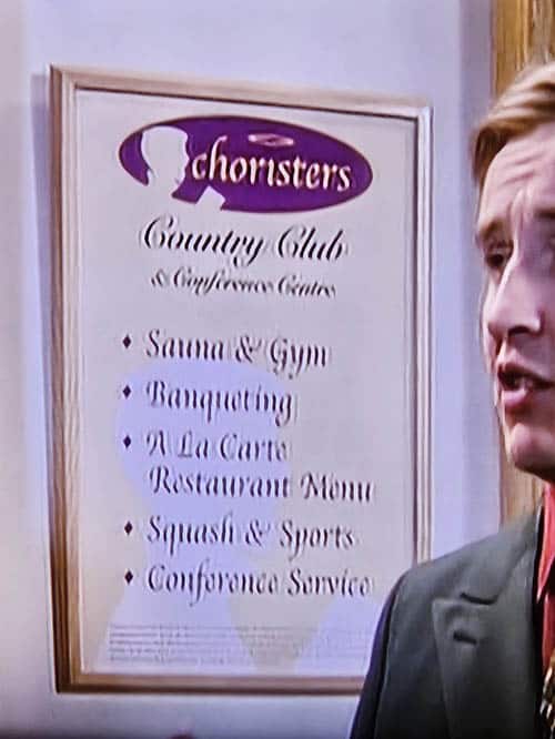
“Choristers” Country Club sign
A reproduction of a sign for the country club Alan was frequenting. Again, I did this in May 2024.
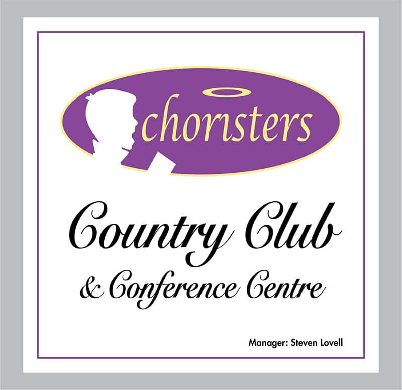
I changed the manager name to mine for no good reason.

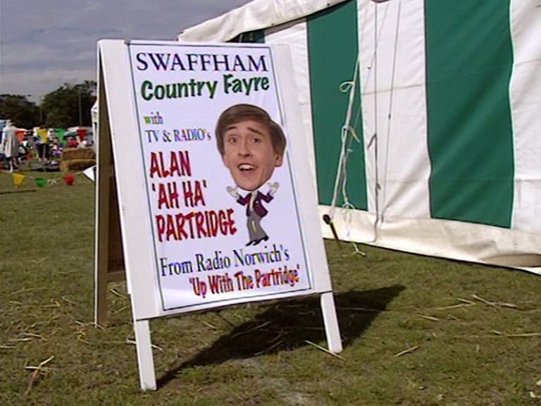
Swaffham Country Fayre sign
An event poster from the series. As with any of these, correct fonts were carefully identified and the typography set accurately. The body was redrawn. The head was taken from the original, undistorted and cleaned up. Done in April 2024.