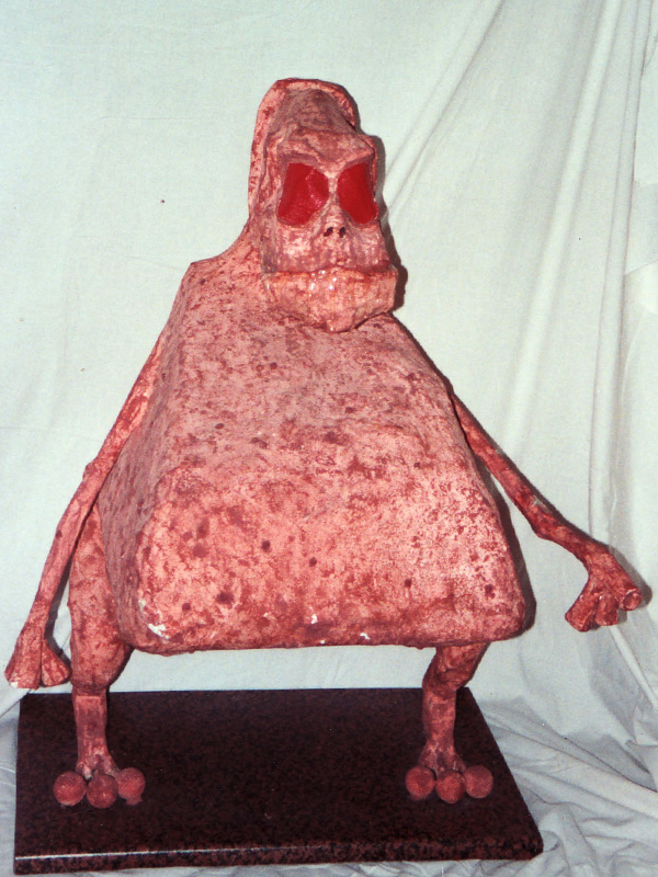
I was always drawing stuff when I was young but it was mostly way too weak and embarrassing to include here. Here’s a relatively small selection stuff I drew at school age and some college work at BTEC, HND and BA levels. Some of it is still pretty bad though, and there’s no wonder I never did graphic design or illustration as a career.

A bunch of characters I created with one of my friends when we were at school. I recreated vector versions of them when I was at college for no particular reason.

I’d decided to make some Christmas cards by getting some images of religious paintings and just make them more amusing by adding some speech bubbles to them. Back in 1994 that was probably quite a task as I wouldn’t even see the internet for another couple of years. This would have required library visits and colour photocopying as I wasn’t even scanning things by that point either.
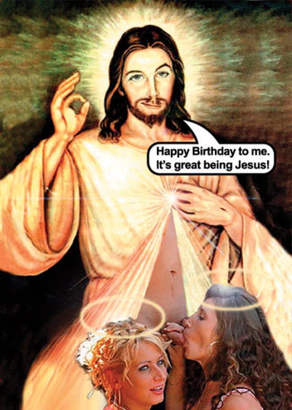
The only things I did to make this was put a smirk on Jesus’s face, make him give the “a-okay” gesture and add the speech bubble. Otherwise the image was found as it was somewhere on the web. (2005)
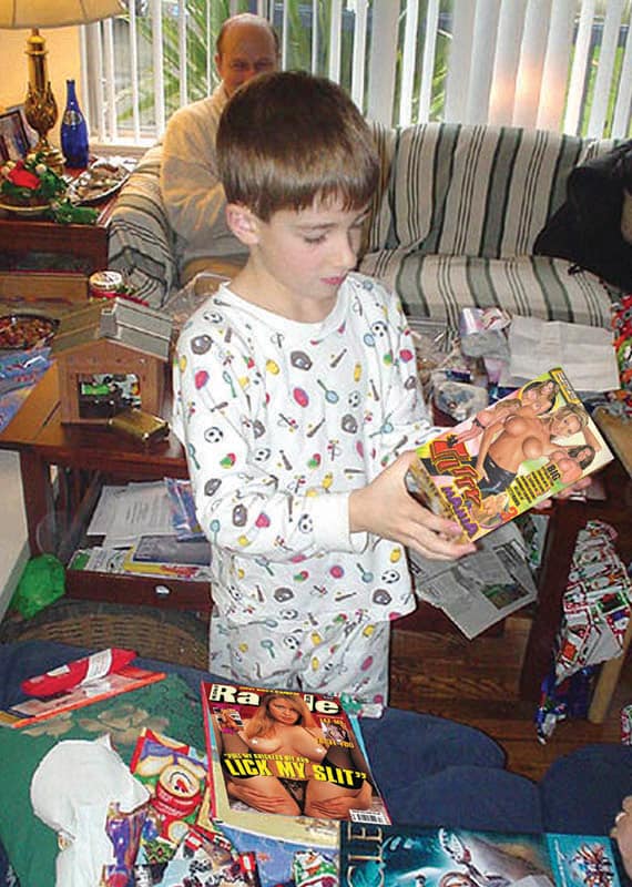
I thought it was quite amusing to have some kid opening a load of porn-based presents and just found images online to make that. (2005)
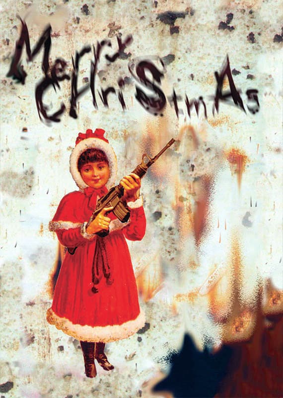
With this one I think I was just trying to mix the traditional with something grungy and inconsistent. (2005)
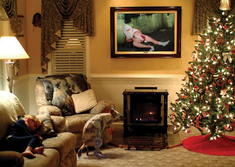
Anothyer Christmas card. I made this but at the time it was so difficult to find a suitable picture of a crapping dog that I ended up using a dingo or hyena or something and hoped no-one would notice. (2005)

An observational drawing of me holding my Barnsley College Student Card. I always had daft passport photo poses on college and bus pass cards that always went unchallenged.

For a while I was into trying to draw grim things, but this was really far off the mark in terms of any kind of realistic portrayal of a massive head injury. Only including it as an example, but it’s bad.

Created for a pub signs college project. It’s alright by my standards, but I’m sure it’s well short of anything a pub would use.

Another piece of improved packaging design, but I never kept the original it was meant to be replacing.

For a calendar project showing the everyday life of film monsters. Good by my standards, but with everything I’ve ever done, well short of professional standards.

I began using an Amiga computer from about 1991 and although the art applications were really basic, they were amazing to use as creating something on screen was almost like magic at that time. I set about making various artwork including film posters, game artwork and famous art. Sadly, none of the digital files could be transferred to other operating systems and all I have to show for countless hours and days of work is two terrible prints from a ribbon printer that caused loads of awful banding.

From the cover of Hot Chocolate’s Greatest Hits, because it was a good strong simple image. It wasn’t a great drawing though.

Another illustration I couldn’t be bothered to finish for some reason. I’ve included the source image with this one.

One of the best examples of my life drawings, with pastels. I was one of the better people in the group, but I got little praise for it. It prompted me to change to print-making and that was a terrible idea.

There’s only so many times you can do a charcoal drawing, so I moved onto a pointillist style. I used an approximation of CMYK felt tips, but the density was never going to be high enough to colour it well.

One day I went pre-prepared with hundreds of 1cm squares of colour cut from a catalogue so I could make a mosaic. Everyone else was still labouring over badly drawn charcoal renderings.

I’d drawn people at school, but this was the first naked life drawing I did when I was at Wakefield College.

I made a few life drawings into roughly drawn landscapes. It wasn’t well done, but I thought it was an interesting idea.

An observational drawing of a crumpled crisp packet. Text detail was always the weakest point on these.

A magazine cover model drawn without th graphics over her, as the first part of an anatomical study.

Another entry from the calendar project showing the everyday life of film monsters. Count Orlok from Nosferatu having trouble picking his nose.

Part of a corporate identity project for a fictional London restaurant. I designed things like menus, letterheads and even labels for a gravy boat. The warehouse was an abandoned one on the River Calder in Wakefield.

A more colourful and abstract piece of work than what I would normally do around that time. It would probably have worked just as well without the droplet.

When on our Art Foundation course, we were all sent out to draw stuff around Wakefield City Centre including statues in the Cathedral.

Further felt-tip pen sketches of statues my fellow students and I were sent out to draw in Wakefield City Centre for whatever reason.

This was the last of several versions of a large cartoon that really ought to have been a lot better than it was, especially in terms of perspective and feasible architecture. It’s actually shockingly bad that I was still thinking this was okay by the age of 19. It wasn’t. It was all kinds of bad but there was a whole lot of effort in it nevertheless.

Another entry from the calendar project showing the everyday life of film monsters. King Kong having a bad hair day here.

I was making some spoof things as part of my BA Major Project which was a sort of scrapbook of my life. The Bland comic was joking about how I used to like the Beano so much, but it was actually rubbish.

I was totally in awe of the “Aliens” style of alien and the film. I decided to paint a full size alien on my bedroom wall that was holding my light switch.

I took some photos of me and my dad having a drink in the West Yorkshire Police Headquarters bar and then painted the scene with an Alien with us. It’s not great but I thought I’d done a good job back then.

I drew some currency at 200% size in colour pencil. The results were shoddy as hell, but again, I thought I’d done a great job of them when I was 15/16. This note was issued between 1975 and 1992.

The best of the currency copies. Oddly, I’ve always thought that my version of the Queen looks slightly better than the one on the actual note. Two versions of the “E” edition were issued between 1990 and 2002.

I drew this well after they’d been withdrawn from circulation but I’d kept one. I’ll still have it somewhere. Two versions of this note were issued between 1978 and 1984.

Part of a bunch of corporate identity work I did for a fictional multinational petrochemical company.

My version on the left looked more modern than the oddly 1970s looking box I picked up whilst in America.

Not as recognisable as the others for this project but it was meant to be the T1000 liquid metal Terminator from Terminator 2. In this case, doing some kind of party trick. This should probably have been grey or in LAPD uniform really.


