
Behind the Scenes
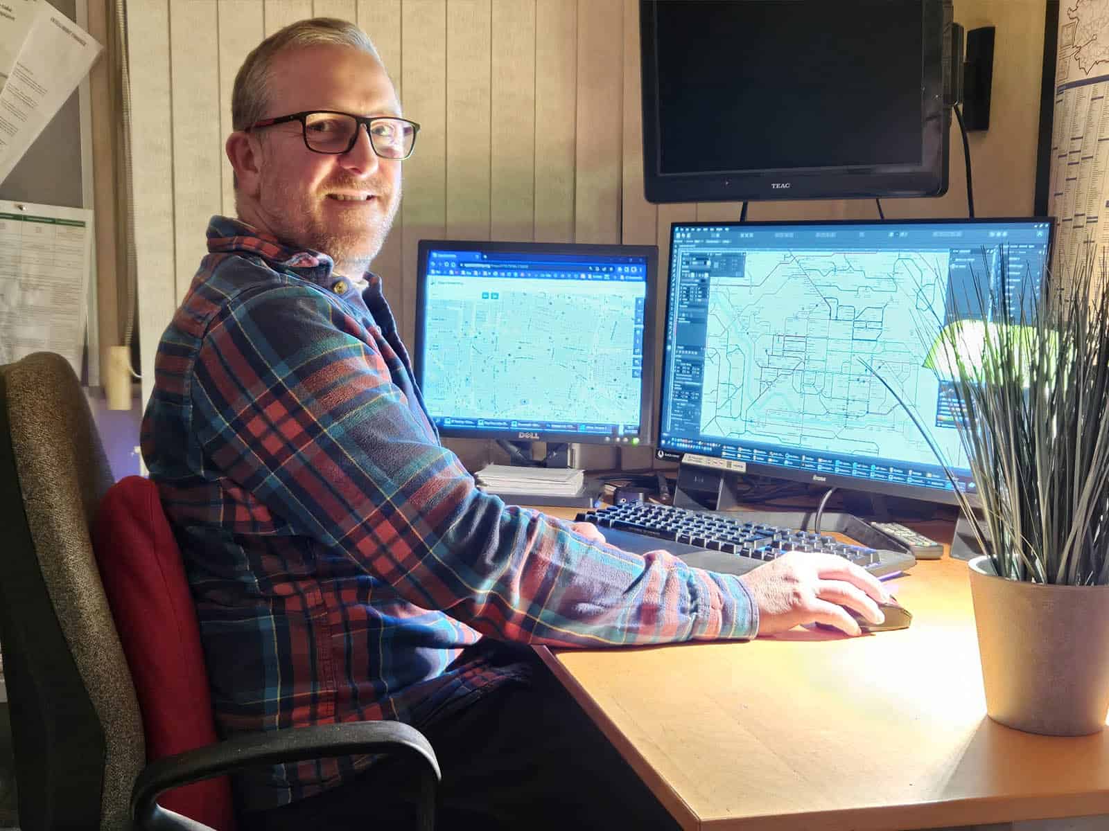
My Workspace
Everything is made at home, using a normal desk setup, a couple of reliable printers and whatever tools I’ve collected over the years, like a paper trimmer for some types of prints.
Having two monitors is almost essential because I can easily refer to one whilst working on the other with enough space.
Sources
No single source is completely accurate, so cross-checking is essential for avoiding errors.
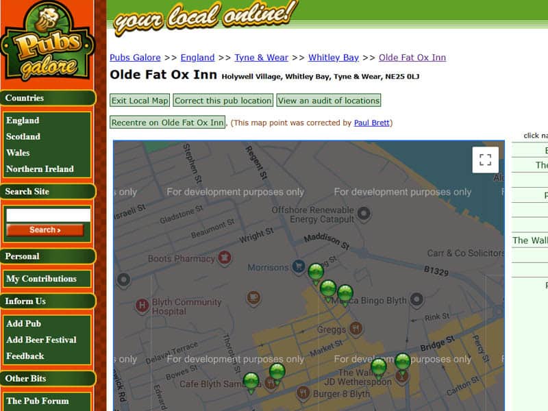
My first source is a website called Pubs Galore, as they have places plotted on Google Maps. But it’s often quite out of date, and markers can be in the wrong place. I can’t copy and paste anything from there, but’s it’s a good visual reference for plotting my own map. I also follow it up with CAMRA, Facebook, business websites, Google Street View and Web searches.
Software
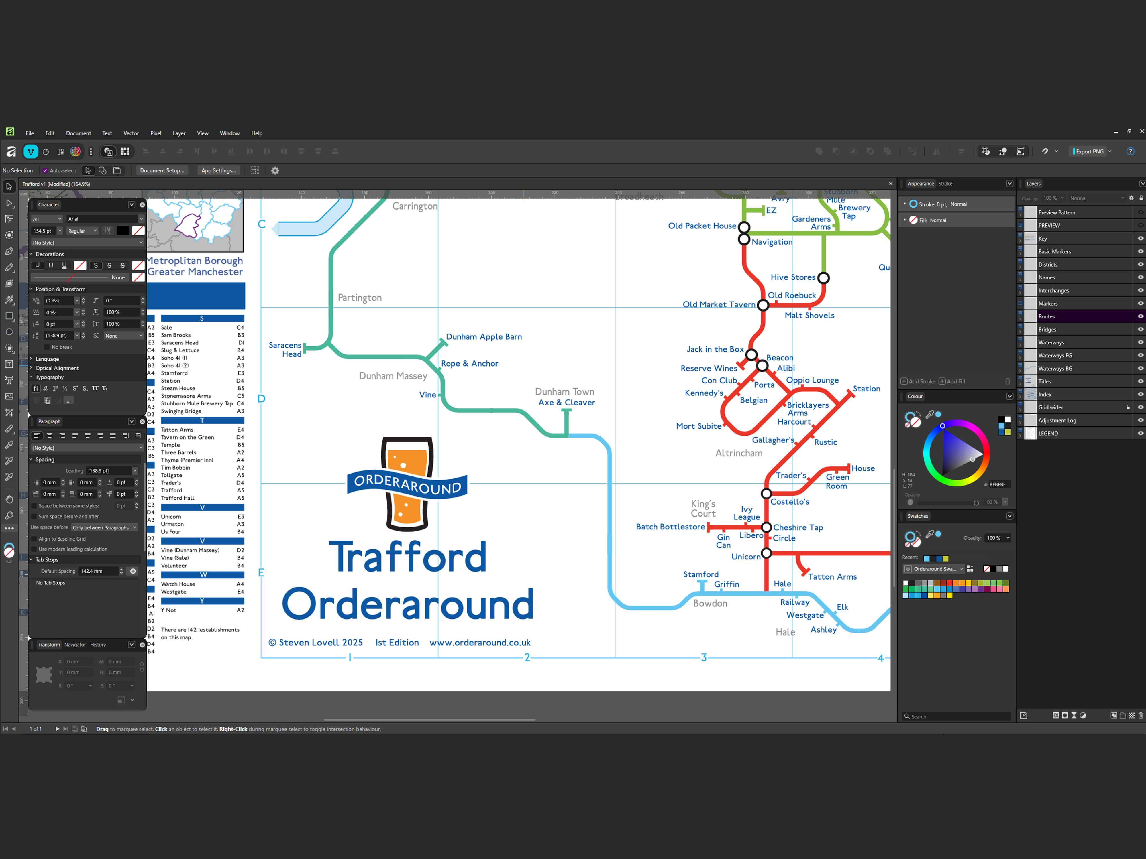
Someone recently asked me what software I use, as though I would chuck in a name of a city and the computer would spit out a wonderful map result at me, with just some of my own styling to sort out. It doesn’t work like that. The software is just a tool, it doesn’t do anything for me at all. I do the research and I have to do the hard work of putting it together.
I currently use Affinity, but any sort of vector software like Illustrator or Inkscape is fine for this kind of work.
Printing
Originally, I got all posters done via a professional printer. I had no alternative, but it meant paying up front for lots of posters I might not sell. And very often, that meant hundreds of pounds for 500 posters, and I’d sell maybe a few dozen over the course of several years.
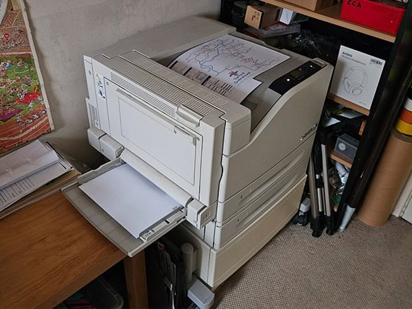
in 2017 I bought a second-hand Xerox Phaser 7500 from York. I began printing the smaller A3 maps myself.
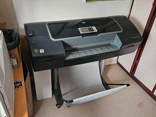
In 2021 I bought an HP Designjet Z2100 from Hull, that I now print the larger “Maxi” size maps with.
I actually have two printers of both types due to problems I had with both, and buying replacement used printers has unfortunately been cheaper than even a callout charge for an engineer.
They’re big pieces of equipment to have four of in the house(!) I keep the two I don’t use for spares. The second Xerox works fine, but the first HP broke down. I bought replacement parts but disassembly was a nightmare. I fitted the new belt but something wasn’t right and it was very much dead. I’m sure it’s repairable, but sadly,. not by me.
If loading and unloading between media types wasn’t a major faff, I’d probably use the HP printer for everything (not just maps) because the colour range is much better. But the Xerox does a great job of the A3 prints as it is.
Between both printers, I can now produce every map in the range myself, which gives me far more control and flexibility than I had in the early days. Plus it’s far more cost effective.
I’m definitely not looking forward to the next catastrophic hardware failure though.
A Legend
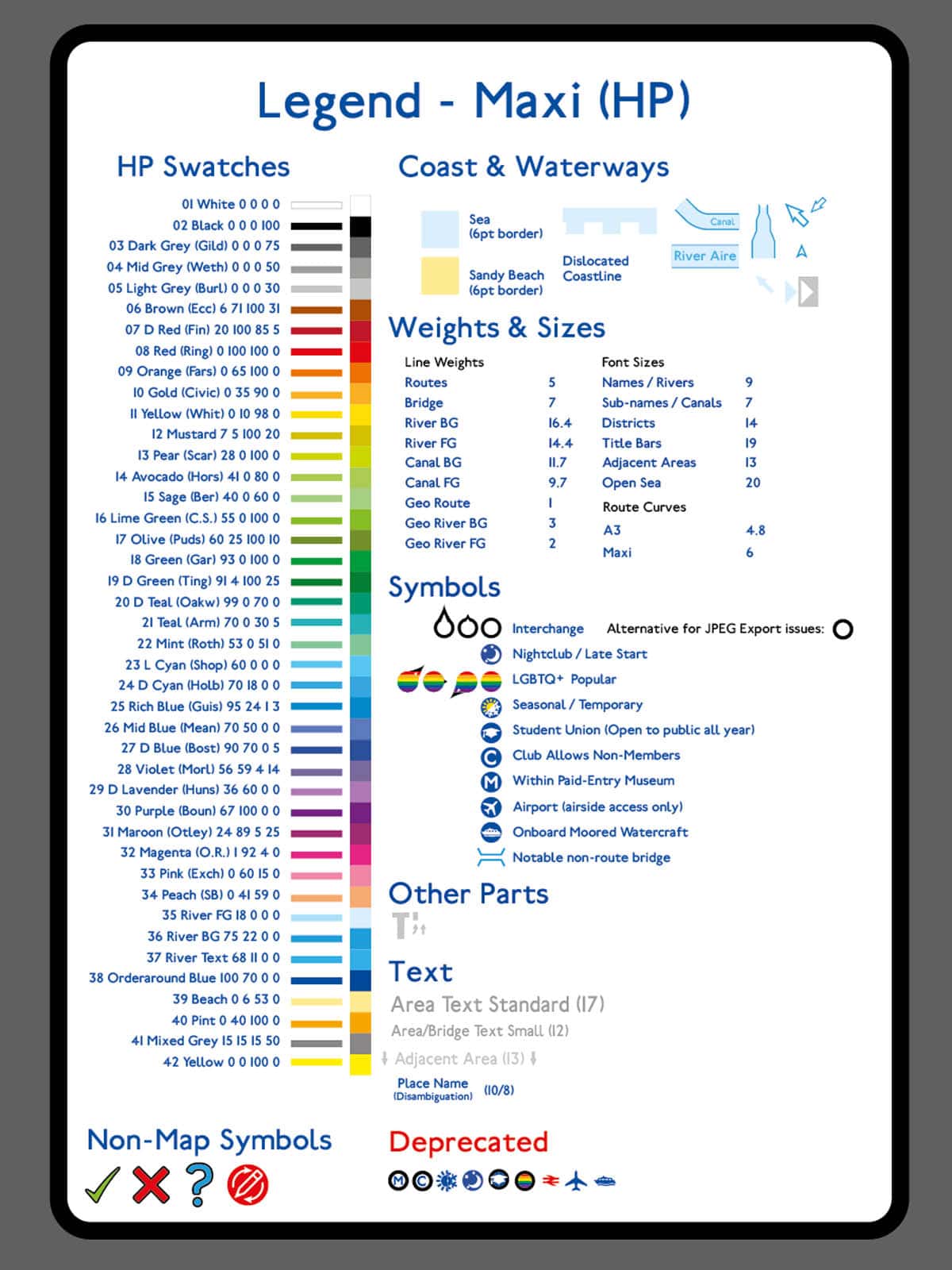
The legend is the internal reference sheet I use when building maps. It includes all the symbols, weights, colours, line styles and text rules that keep everything consistent across the series. As maps grew in number, I needed a wider range of symbols and a standardised repository of elements. This isn’t the same as the “Key” section on the maps, it’s just for me when I’m building them.
I also needed it in two sizes and the colours had to be adapted for output from two types of printer, that vary.
Colours
The colours have four naming conventions:
- Number
- Colour description
- Area of Leeds it was first used for
- CMYK colour values
Symbols
Some unusual venues have had one-off symbols over the years, but I generally keep the symbol set limited and consistent. I generally avoid including clubs,. but sometimes I include them with a “C” symbol to please locals that seem to be insisting on them being added.
Retiring Symbols
I used to include markers next to pubs or bars that were adjacent to a railway station because it felt like a link to the tube map. I ended that in about 2022. I sometimes update symbols to be clearer too, but I keep a record of deprecated symbols in the legend.
A Wasted Map
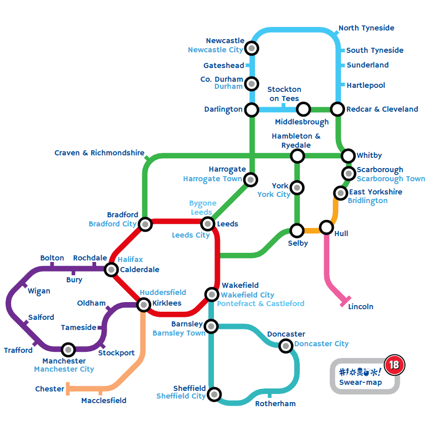
In July 2025, I was thinking about different ways of presenting the map availability options on the homepage of my website and spent several days creating this vector-based angular map of UK counties and administrative areas. It looks good, but ultimately it wasn’t right for what I needed. Instead I just extended and improved the tube-type map I already used.


Contacting Transport for London (TfL)
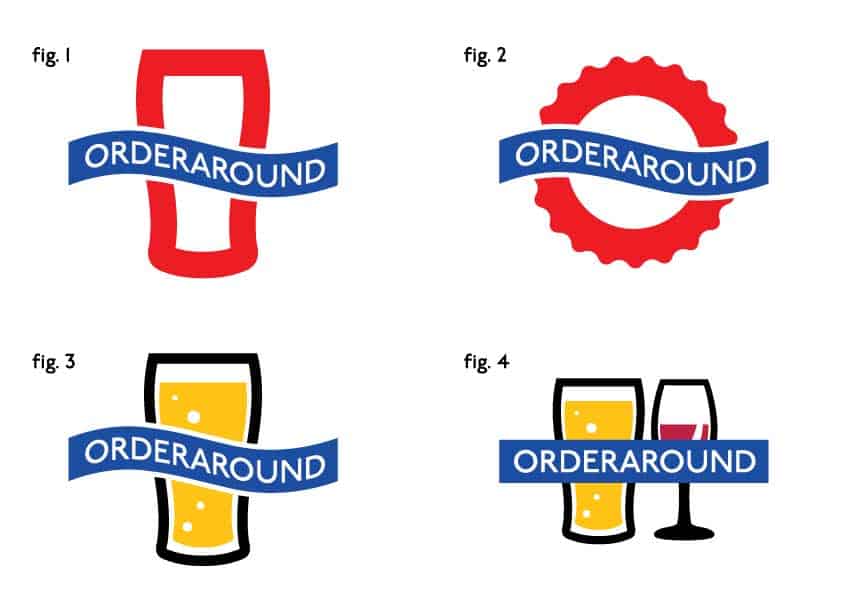
When I was doing the first map, I contacted TfL to see if they’d have a problem with any logo ideas I was considering. My first preference had been the red circle made to look like a beer bottle cap, with a blue wavy bar instead of their straight one. They weren’t happy about the first two options though because they were too similar to their branding.
As it happens, I’m glad they said that, because I cannot even imagine having my logo different to how it is now. The only thing I’ve changed over time is the tone of the beer.
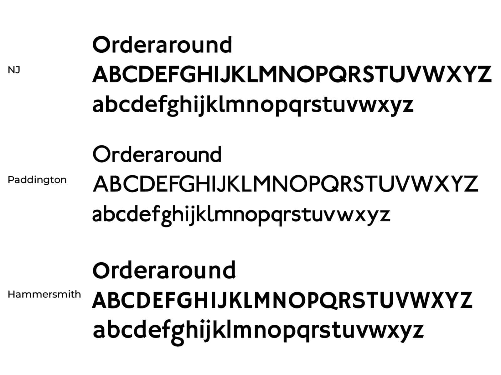
Fonts
I also asked TfL if I could use their “NewJohnston” font, but unsurprisingly the answer was a big no.
Fortunately though, someone had created a very similar font called “Paddington”, that I use on all parts of my maps. However, on my Orderaround website, anything that would use Paddington in print is replaced by ‘Hammersmith’, because it’s a Google font that works a bit better on screen and is visually similar.
Next, Promotion & Media