
Creating a Map
The Rules
Maps areas are usually chosen based on where’s adjacent to those already done. The main criteria for places to include are that you can go in and get a drink, and that the venue feels welcoming, comfortable, and accessible for casual drinking without food or other services. Many hotels, cafés, and restaurants meet these standards and have been included on the map.
With some limited exceptions, the following types of licensed premises are generally not included on this map:
- Bars within most leisure or cultural facilities such as cinemas, theatres, sports venues, art galleries, museums and exhibition centres.
- Venues that are primarily activity-based rather than drinking-focused (e.g. karaoke, snooker, pool, axe throwing, crazy golf, roller or ice skating, ten-pin bowling).
- Private members-only clubs.
- Sports and social clubs or those with a primarily political or religious affiliation.
- Gentlemen’s clubs and XXX-related venues.
- Ticketed entry entertainment venues.
- Student Union bars.
Sometimes it can be difficult to decide if a place belongs on here or not. When in doubt, research it by looking at their social media or website, but there’s always a grey area.
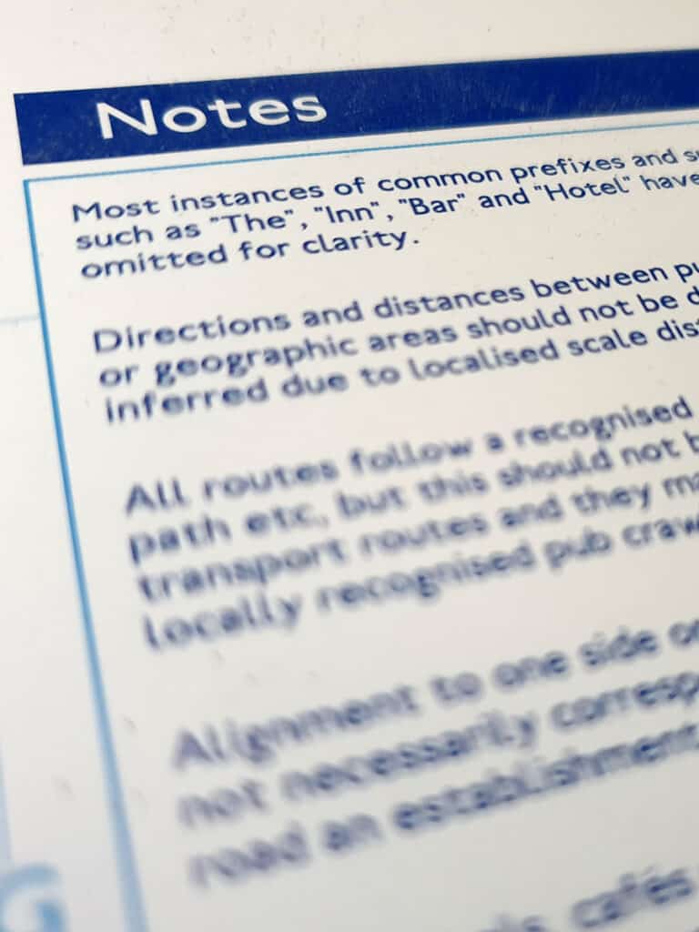
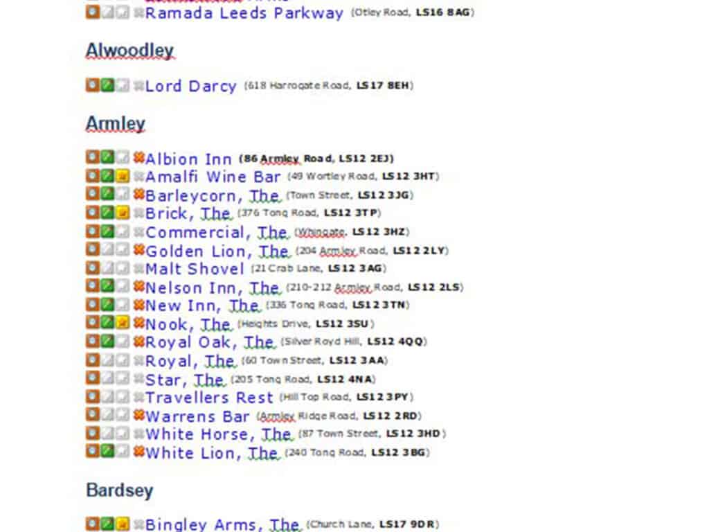
Official names may differ from those shown, as most instances of common prefixes and suffixes such as “The”, “Inn”, “Bar”, “Club” and “Hotel” are omitted for space and clarity.
Plotting the area
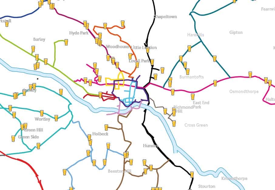
First things first. I download an open-source vector map for a new area and clean it up extensively so I only have the most basic stuff on it. Then I begin adding dot markers for premises locations. I add the names as well, so I can easily edit or remove these later when doing any updates.
This can take a very long time to do. This plotting helps reveal:
- dense areas that will be expanded on the final map
- sparse areas that will have to be compressed
- Rivers to include to help with area recognition and a throwback to the real tube map
- names of areas to help with orientation, (as pub and bar names don’t do this like tube stations do)

Adding Routes
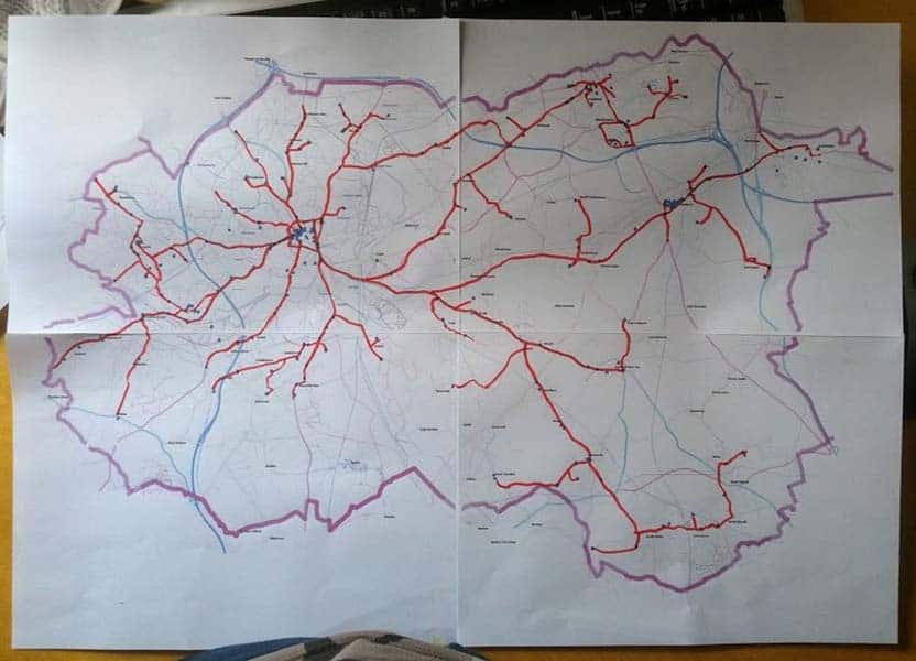
After all the locations are plotted, I choose roads and paths that best link them together.
All of this information doesn’t just sit on my computer after I’ve created the tube-style map. The routes and markers ands area boundary get used in the design. This is really useful in helping people understand the design process and helping them understand how the distorted geometric design relates to real-world geography.
I’ll usually have a good idea from this step which of two main map sizes it will need to be made into.
The smaller A3 poster size is 297 x 420mm (11.7 x 16.5 inches).
The large poster size is 610 x 915mm (24 x 36 inches).

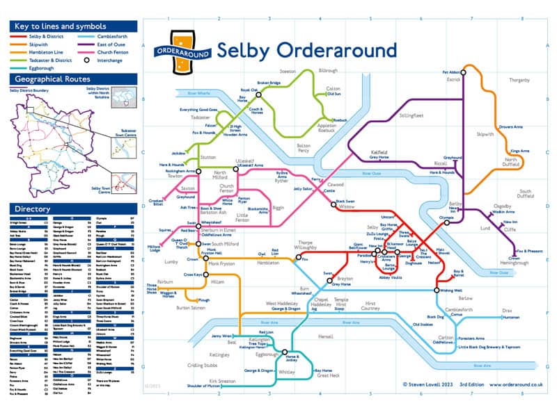
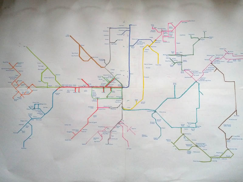
Making it geometric
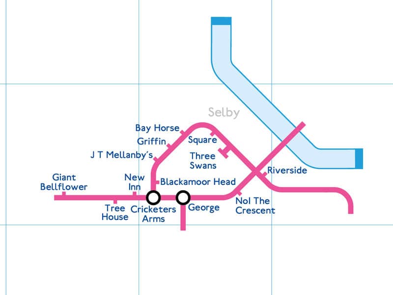
After several days of non-stop plotting, the most important visual part begins. The familiar angular pub map design starts with a dense area like a town or city centre, adapting the geographic paths to geometric ones.
During this part, it’s important to make sure all the labels can fit and not overlap any routes or rivers. Some people note that the markers are on the wrong side compared to reality. On a diagram map like this, only the order of the places matters. I’ll put them on the correct side of the road where possible, but they can be flipped for space or balance.
Mapping the full area
Getting all the markers, text and paths to fit is quite a challenge and takes quite a while.
Some areas feel impossible at first, but most of the time everything can be made to fit once enough adjusting and shifting is done. Sometimes an area will need to be upgraded from an A3 size map to a “maxi” size one that are usually reserved for larger or denser boroughs.
Rarer still, I might need to dislocate a part of the map due to space issues.
And so far, the only map to be made into a portrait orientation is the borough of Manchester.
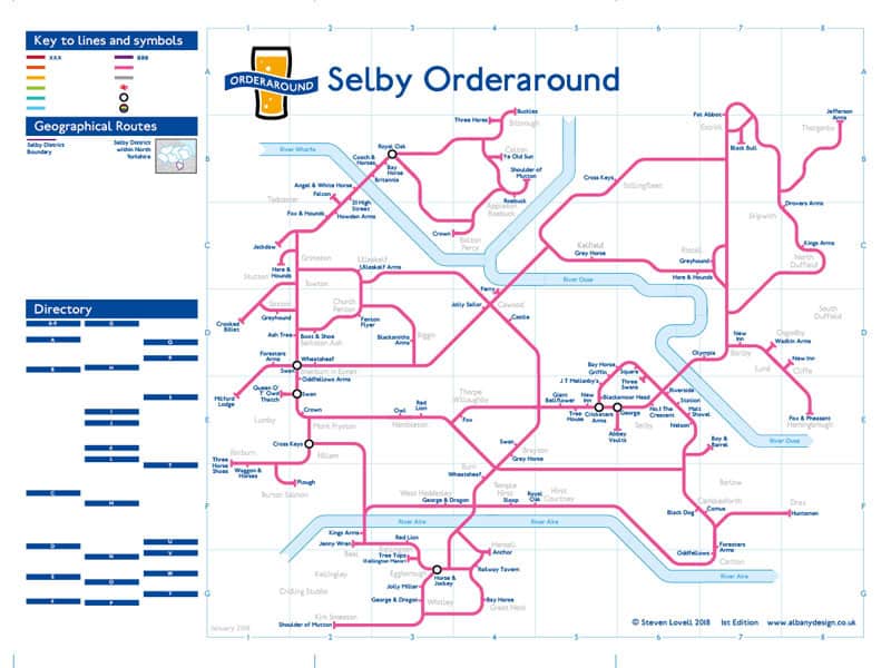
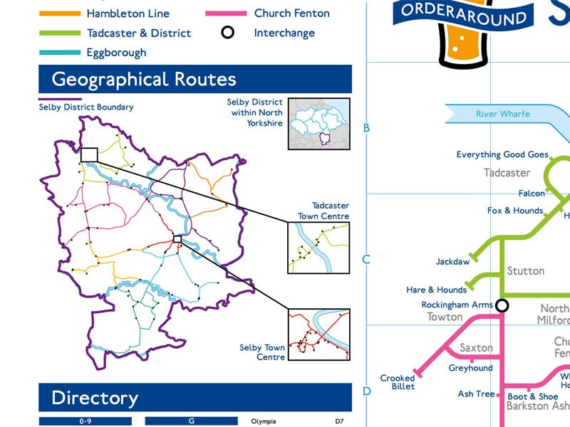
Geographical Map, Key and Directory
After the main map is done, I still need to colour the routes on both types. I need to give names to those routes and create county maps with the highlighted borough. I’ll also usually do a zoomed in version of one or more prominent city or town centres.
Logging all the grid references for the directory is a tedious manual task that can take many hours on larger maps. And I very much doubt anyone really uses them, but they’re part of the design, so must be completed.
The “finished” Map
Completing the map isn’t even the end of the work. There’s still the matter of creating a web page for it. That will usually require some detail photos of the printed map, sales stuff, and factual information about when the map was made and how many places are on it.
At this stage I’ve made the map presentable, but my research is only as good as the information available to me, and there will always be edits to make.
Next I need to join Facebook groups to get feedback.
Earlier ways of working
In the early days, I didn’t really have a proper workflow. I had various inefficient ways of working, including:
- large markers
- compiling lists
- excessive symbols
- doing anything on paper
- not including pub names on the prep map
- drawing angular maps on clear plastic over taped together prints

Next: Behind the Scenes